Yummy Pot
Info

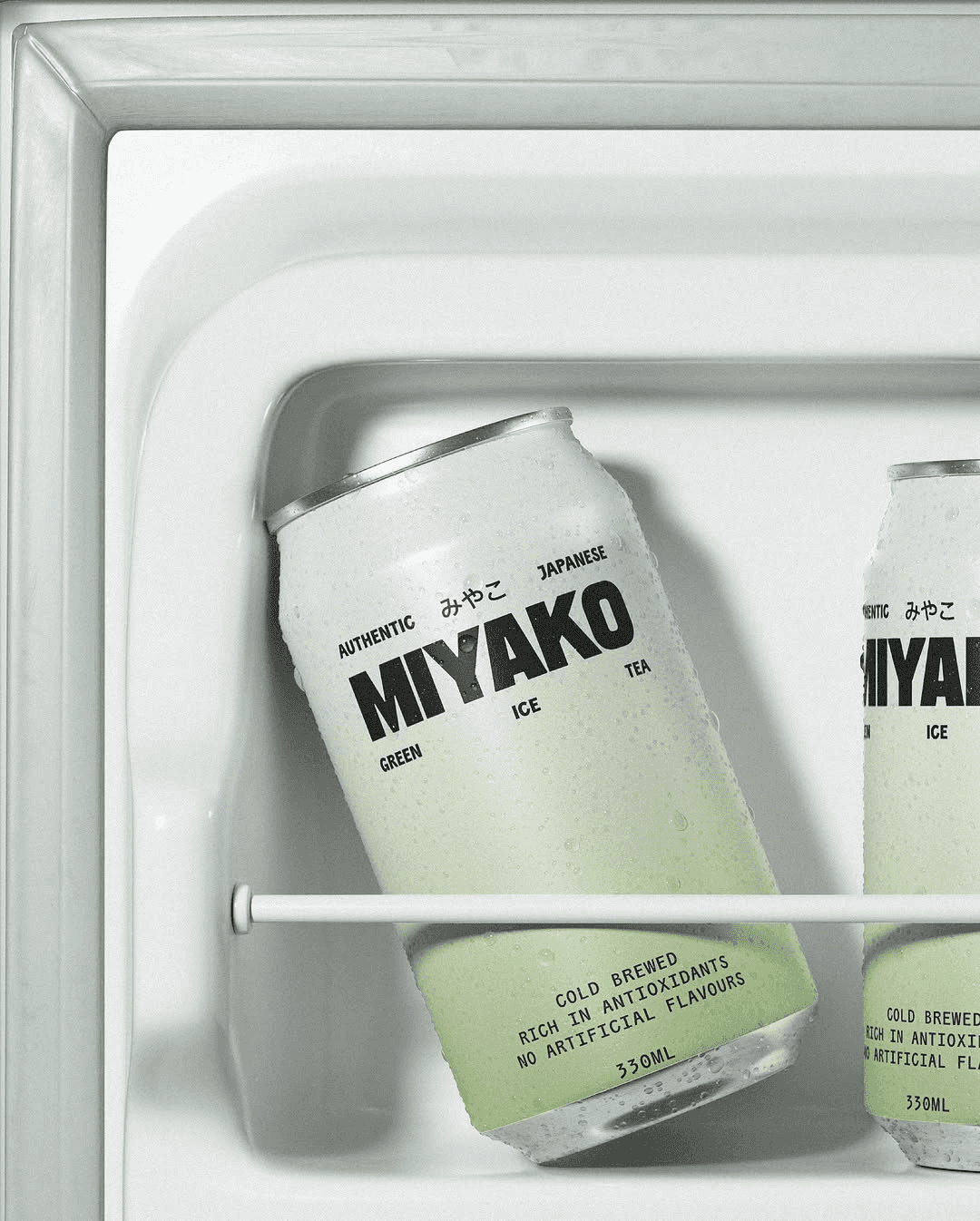
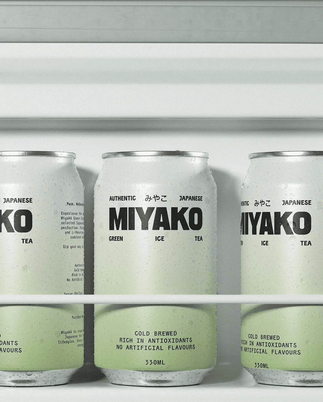
Yummy Pot’s idea centers around a modern, playful take on asian inspired comfort food, where bold flavours are served with a sense of warmth and nostalgia. The visual identity blends clean minimalism with a pop of character, combining vibrant colour palettes and quirky sans-serif typography. It combines a warm, approachable tone with subtle cultural references. The goal was to explore how type, colour, and form can work together to evoke both authenticity and modern street-food energy.
Contributions
Messaging, Brand Strategy, Visual Identity, Marketing Collaterals, Packaging
Industry
Food & Beverages
Info
Yummy Pot’s idea centers around a modern, playful take on asian inspired comfort food, where bold flavours are served with a sense of warmth and nostalgia. The visual identity blends clean minimalism with a pop of character, combining vibrant colour palettes and quirky sans-serif typography. It combines a warm, approachable tone with subtle cultural references. The goal was to explore how type, colour, and form can work together to evoke both authenticity and modern street-food energy.
Contributions
Messaging, Brand Strategy, Visual Identity, Marketing Collaterals, Packaging
Industry
Food & Beverages


Yummy Pot
Yummy Pot
Looking for more?